In imaging, dynamic range refers to the difference between the brightest and darkest values in a scene. Cameras are not able to capture as much dynamic range as our eyes, and most display technologies are not capable of representing them.
I’ve been doing some experiments with HDR imaging and processing, because I think the process of converting real-life scenes into representations can shed some insight into what makes a painting look like a painting, instead of a photograph.
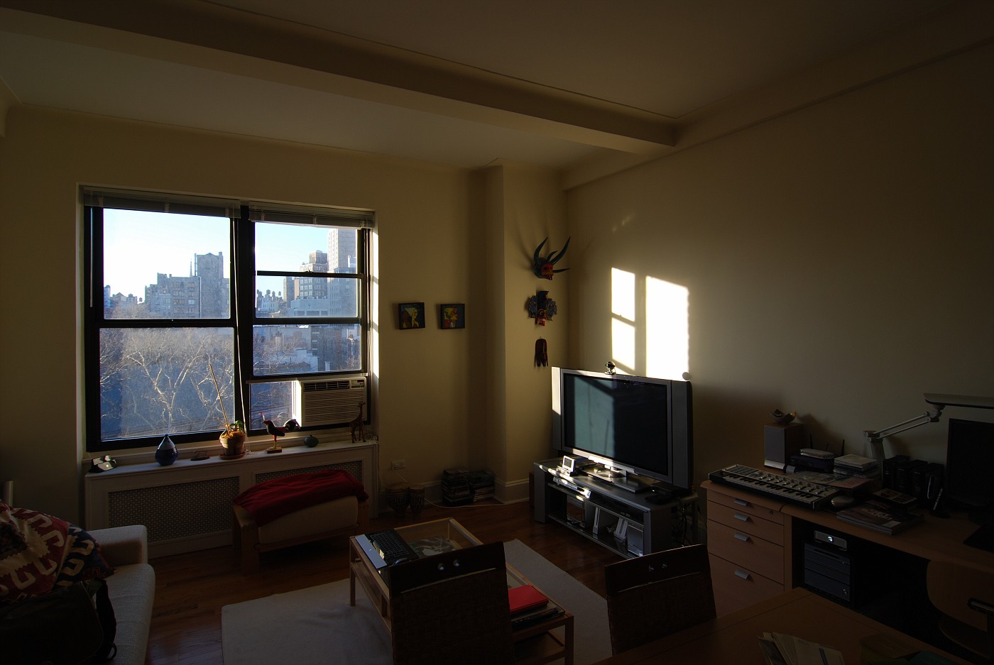
For example, in the scene below, the cityscape seen through the window is over-exposed, while the room is in darkness. The camera cannot capture both the high values and the dark values at the same time.
However, by taking a number of pictures of the same scene, but with different exposures, you can overlay them and reconstruct a picture where a lot more information is visible. This technique is explained here. I processed the same scene shown in the previous image, using 3 separate exposures, and the result is shown below:
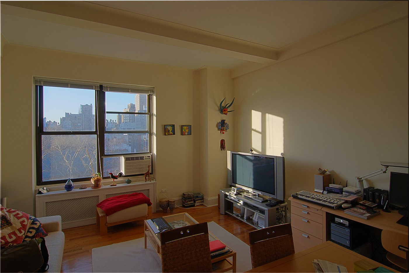
Note how the view through the window is now much more detailed, while the room is much lighter. The scene looks more “natural” than the original camera exposure. It still looks very much like a photograph, not a painting.
However, there is a fashion now, where HDR images are processed not to look natural, but to maintain as much detail as possible. This relies on using specific techniques for a process called “tone mapping“, basically the conversion from an (undisplayable) high dynamic range image to a lower dynamic range image. These images look very “painterly” and artificial. Check out the Flickr HDR group, for example.
While there are a number of tools and techniques for achieving this exaggerated “HDR” look, I found one of the best to be free: QTPFSGUI. This piece of Open Source software handles two key tasks: aligning the different exposures, and “tone-mapping” the resulting HDR images so that they can be displayed on regular monitors.
Here’s how my test image looks after being processed through this program:
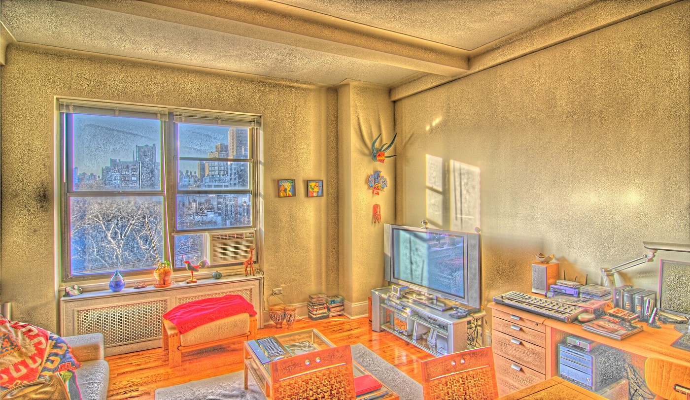
The image looks much more like a painted illustration, than like a photograph. This is probably because the tone-mapping process is very much what a human painter or illustrator does. Rather than drawing everything “photographically”, an artist will tend to show more detail, more features.